The Graph Tool provides tab-organized graphing panels for real-time visualization of numeric outputs from selected objects. Multiple graphs can be added to a single panel to compare data such as vessel motions (heave, surge, sway, pitch, roll, yaw) or the positions and forces on moving components during lifting operations. Graphs update in real-time as the simulation runs. Graphs can also plot data from imported datasets, offering an alternative way of visualizing time-series data.
Graphs are color-coded for quick identification, and recorded data can be exported to CSV — including timestamps and per-trace values — for offline analysis, reporting, or import into other tools. Common uses include tracking vessel responses, validating control outputs, recording joint or actuator motion, and capturing time-series data for post-run comparison.
Left-click
the object in Sandbox that you want to analyze. The tool will then indicate that an object has been selected and provides the relevant options to select from. In this case a vessel named AHTS_UT731CD_FAR_FarSagaris is selected:
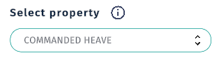
Select a property to graph from the Selectproperty drop-down menu. The available properties depend on the type of object selected. For a vessel, some relevant options include heave, surge, sway, pitch, roll, yaw, to mention a few. In this example, the COMMANDEDHEAVE is selected:
Note
Some properties, such as spacial coordinates (position, orientation) or forces/moments, may have multiple components (e.g., North, East, Down). When selecting such properties, ensure you choose the specific component you wish to graph.
Select a unit of measurement from the Unit drop-down menu. The options will vary based on the selected property. Some common options are:
Measurement
Unit
Distance
Meter
Nautical mile
Millimeter
Mass
Kilogram
Ton
Orientation
Degrees
Radians
Degrees 0 to 360
Degrees -180 to 180
Scaling
0 to 1
Percent
Tension/Force
Newton
Kilonewton
Ton
Velocity
Meters per seconds
Knot
kilometers per hour
Select a time source from the TimeSource drop-down menu. The options are:
Time Source
Description
Use
Simulationtime - Core
Uses the simulation’s internal clock as the time source for the graph.
Use this option for most objects
Repeating Date Time Controller Actor
Uses a repeating date-time controller actor as the time source for the graph.
Use if you want to graph a dataset that is controlled by the timeline.
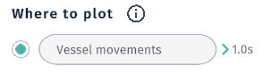
Enter a name for the graph in the Wheretoplot field. If left blank, a default name will be assigned. If you have an existing graph, you can select the existing graph as the destination.
Select the desired sample time from the presets in the drop-down menu. Available options are:
Sample Time
Description
0.1s
Data points are sampled every 0.1 seconds.
0.25s
Data points are sampled every 0.25 seconds.
0.5s
Data points are sampled every 0.5 seconds.
1s
Data points are sampled every second.
Review the Sample Time section below for more details on how sample time affects plotting of graphs.
Note
Subsequent graphs not added to an existing graph will create a new tab in the graph panel .
Click the StartPlotting button
to begin visualizing the selected data.
The graph panel appears, plotting the selected property over time.
To create a new graph directly from the graph panel, left-click
on the button
located at the top left corner of the graph panel. This will close the graph panel and open the graph creation interface where you can select a new object and property to plot as described in the Creating a Graph section above.
By default, the graph uses an automatic scale that adjusts based on the data range. Left-clicking
on the graph area allows you to move the graph on the Y axis. Movement along the X axis is locked as long as the AutomaticScale button is toggled to “On” position. However, by switching this toggle to the “Off” position, the automatic movement of the canvas along the X axis is disabled, allowing you to manually pan the graph in both directions. This is useful when you want to closely examine specific sections of the graph without it shifting as new data comes in.
The X axis represents time. Use the Axiswidth field to set the time span displayed on the X axis. Time can be entered in the following units using the drop down menu to right of the text field:
Unit
Description
Second
Enter time in seconds (e.g., 60 for 60 seconds).
Minute
Enter time in minutes (e.g., 5 for 5 minutes).
Hour
Enter time in hours (e.g., 2 for 2 hours).
When the AutomaticScale toggle is set to “Off”, the value can also be adjusted by scrolling the middle mouse wheel
up or down while hovering over the graph area.
The Y axis represents the value of the selected property. If the AutomaticScale toggle for the Y axis is set to “Off”, you can set the minimum and maximum values for the Y axis to suit your analysis needs. This allows you to zoom in on a specific range of interest. The unit selected when the graph was first created can also be changed by using the drop-down menu located to the right of the input fields.
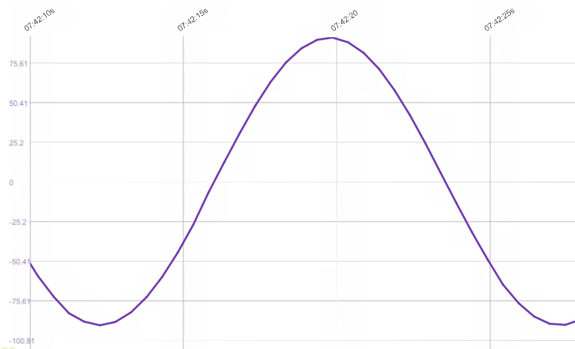
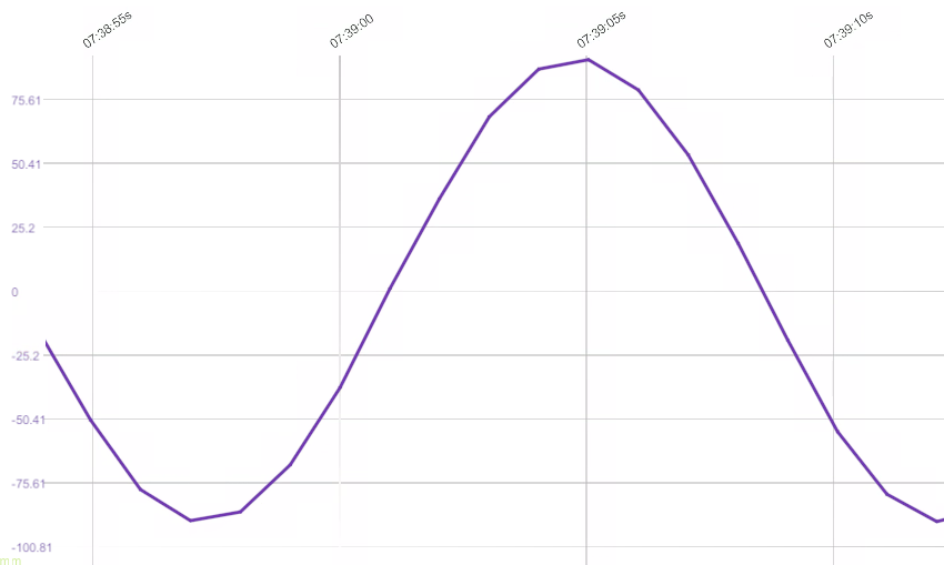
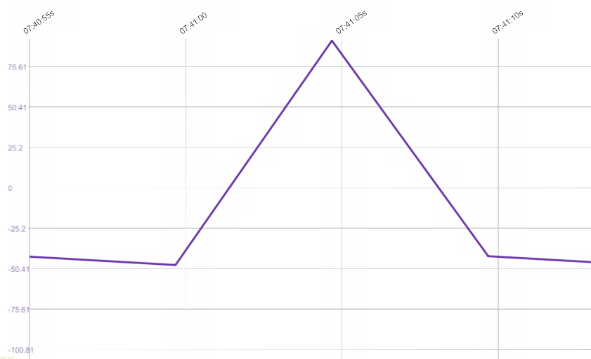
The SampleTime field allows you to define how frequently data points are recorded on the graph. By default, this is set to 1, meaning data is sampled at an interval of 1 second. Use this value to fine-tune the granularity of the data being plotted. A smaller sample time results in more data points and a more detailed graph, while a larger sample time reduces the number of data points, which can help in visualizing broader trends without excessive detail.
Illustrations of how different sampling times affect the graph’s detail level.
This opens the graph settings where you can select a different color for the graph, and gives you the option to delete the graph entirely by clicking the trash can
button located to the right side.
To change the color of the graph, left-click
on the color box to open a color picker. Select your desired color and the graph will update to reflect the new color. Available colors are:
Note
Deleting a graph when there is only one graph in the panel will close the entire graph panel.
To delete an entire graph tab (which may contain multiple graphs), left-click
on the tab you wish to delete to make it active. Then, left-click
on the
button located at the bottom right corner of the graph panel. A confirmation dialog will appear; click Delete to confirm deletion of the entire tab and all its graphs. Press Cancel to abort the deletion.
To collapse the graph panel and free up screen space while keeping the graph accessible, left-click
on the
icon located at the top right corner of the graph panel.
Collapsed graph panel. A collapsed graph panel can be moved around the screen by left-clicking
and dragging the panel using the header area.
To restore a collapsed graph panel, left-click
on the
icon located at the top right corner of the graph panel. This will expand the graph panel back to its full size with all its tools.
Note
Selecting a different tool from the left-hand menu while the graph panel is visible will automatically hide the graph panel. To bring it back, simply re-select the Graph Tool from the left-hand menu and left-click the
button located at the top left corner of the graph creation interface menu.
Graphs are not stored with a scene, but you can save a graph panel setup as a file to load later. To save the current graph panel configuration, left-click
on the
button located at the bottom right corner of the graph panel. This opens a file dialog where you can specify the location and name for the graph configuration file.
To load a previously saved graph panel setup, left-click
on the
button located at the bottom right corner of the graph panel. This opens a file dialog where you can select the desired graph configuration file to load.
To export the data from the graphs in the current panel to a CSV file, left-click
on the
button located at the bottom right corner of the graph panel. This opens a file dialog where you can specify the location and name for the CSV file. The exported CSV file will contain timestamps and values for each trace in the graph, allowing for offline analysis or import into other tools.


 the object in Sandbox that you want to analyze. The tool will then indicate that an object has been selected and provides the relevant options to select from. In this case a vessel named AHTS_UT731CD_FAR_FarSagaris is selected: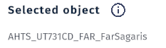
 to begin visualizing the selected data.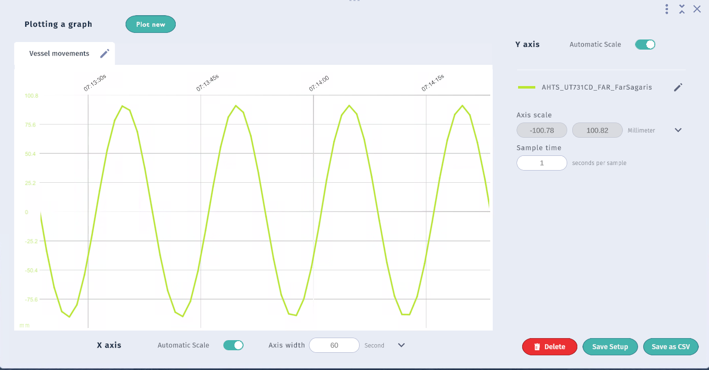
 located at the top left corner of the graph panel. This will close the graph panel and open the graph creation interface where you can select a new object and property to plot as described in the Creating a Graph section above.
 up or down while hovering over the graph area.
 located at the top right corner of the graph.
 button located to the right side.

 button located at the bottom right corner of the graph panel. A confirmation dialog will appear; click
  icon located at the top right corner of the graph panel.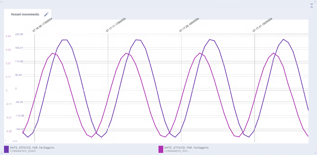

 button located at the bottom right corner of the graph panel. This opens a file dialog where you can specify the location and name for the graph configuration file.
 button located at the bottom right corner of the graph panel. This opens a file dialog where you can select the desired graph configuration file to load.
 button located at the bottom right corner of the graph panel. This opens a file dialog where you can specify the location and name for the CSV file. The exported CSV file will contain timestamps and values for each trace in the graph, allowing for offline analysis or import into other tools.